On 9 Sep, 2014 With
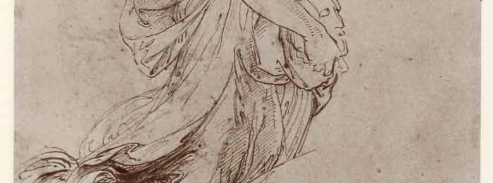
It is the problem of the draughtsman to represent on a plane – his Paper, the multiple three dimensional appearances of nature, conveying the impression of light, depth and movement, as well as the texture of materials, by the sole means of the gradations and modelling in the greys as they go from the white of his paper to the darkest value of his drawing instrument. In studying the old masters from this point of view we see that it is possible to establish a hierarchy among them. Mediocre draughtsmen simply do the best they can with nature as they see it. Their eye works like a mirror that contains many imperfections. Portraiture is their largest field of activity because,…
Read More
On 2 Sep, 2014 With
One of the most important effects of the quality of suppleness and pliability possessed by all the great pointing mediums from to Rubens was the freedom they allowed the artist in his drawing. Unhindered by the difficulties of working with an inadequate medium, his brush could flow as his mind and eye and knowledge directed. Without the distractions that are always caused by any technical limitations, he was free to give his entire attention to the expression of his ideas and the exercise of his abilities. The supreme examples of this ease of execution are to be seen in the great masters of the sixteenth and seventeenth centuries, when the understanding of the human form together with the skill to…
Read More
On 30 Aug, 2014 With
Sometime around the end of the seventeenth century, the painting methods so beloved of the old masters were mysteriously lost—how exactly, no one is really sure. Ever since then, artists have tried and fail to rediscover these techniques, which yielded the masterpieces of Titian, Rubens, Rembrandt and Velasquez. The origins of these techniques can be seen as well in the artists that came before them (Jan Van Eyck, Memling, Giovanni Bellini and others) in a more rudimentary form and always on a much smaller scale, being limited by a lack of proper canvas and materials. For reasons not yet known, something of the inherent magic of oil painting seemed to have dulled after the Renaissance, with a dampening (subtle…
Read More
On 8 Jul, 2014 With
The underpainting was a core feature of the Venetian Method, and was often executed in opaque colour, rather than neutral greys. Many colour variations existed on this technique, such as Venetian Red and Flake White, with the only real limitation lying in the fact one ought limit one’s palette to lean paints (paints with a low rate of oil absorption) which are either opaque or very high in tinting strength. High tinting strength paints with a high oil absorption rate (fat paints) may be used only if mixed in minute quantities with very lean paints, so as to keep the underpainting leaner than the layers that will be applied above. Once the colour has dried, it can be modified with…
Read More
On 1 Jul, 2014 With
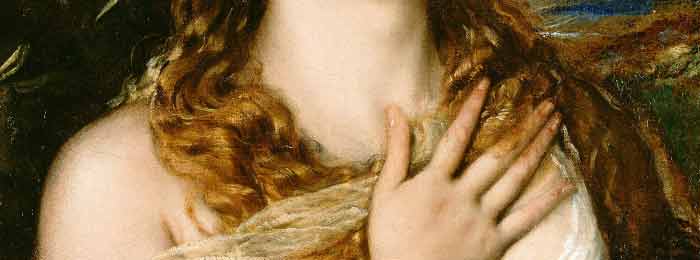
“Glazing” in relation to the Venetian Method refers to the application of a darker transparent paint over a lighter area. Doing so causes light rays to pass through a transparent darker layer, bouncing off the lighter surface underneath, then returning to the viewer’s eyes, and was useful in creating subtle optical illusions. Only the Renaissance practice of glazing can produce this particular effect, one which results in the look of a warm glow and more saturated colours than the same pigment could achieve if applied more thickly and opaquely. Modern methods, with their more opaque results, lose a sense of distance when one is looking at shadows. Rembrandt’s glowing and rich dark browns owe their origins to this Venetian…
Read More
On 10 Jun, 2014 With
Modern painting methods are far more rapid and direct than those used by the “old masters,” and as such, make replicating the works of these great artists a challenge, even when we render each colour and tone as closely as seems possible. The transparency and luminosity that was created by the heavily layered techniques of the old masters is found lacking regardless of one’s efforts to recreate colour and tone. This mysterious challenge invariably proves very frustrating when attempting to copy Renaissance art, with our current methods always producing something that appears heavy and overly opaque by contrast. Some have attributed the wondrous lustre and more translucent look of the old masters’ work to time, but that is not…
Read More
On 24 Jun, 2013 With
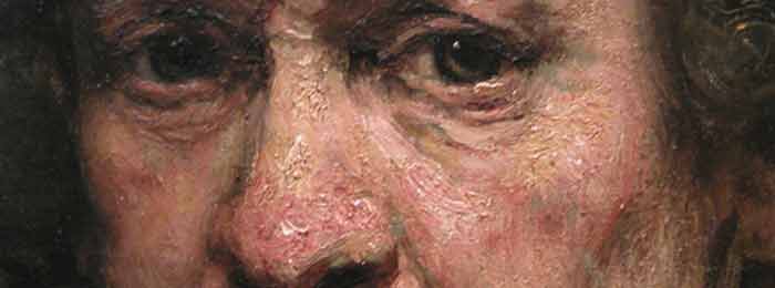
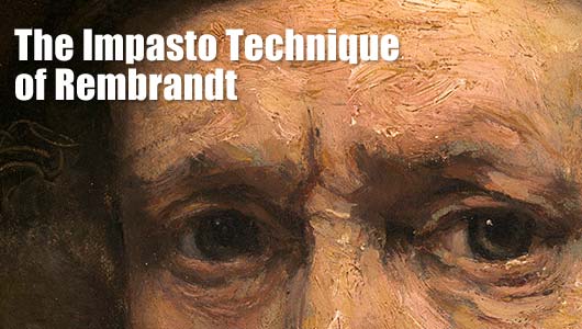
Creating Impastos in Oil Paintings The simplest way to create an impasto surface is to apply paint in large amounts, usually with either a brush or palette knife. Commercial oil colors have a heavy consistency, so this can be achieved by working directly from the tube applying the colors in thick layers. Opacity and built-up texture are usually interrelated, with much of the thickest impasto consisting of solid and opaque pigments, such as lead white or titanium white. Passages of thickly applied paint can also be translucent, so extender pigments are chosen that supply both bulk and transparency. The Impasto Technique of Rembrandt Impasto is paint laid on a canvas or panel in quantities that make it stand out from…
Read More
On 16 May, 2012 With
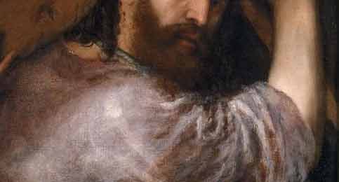
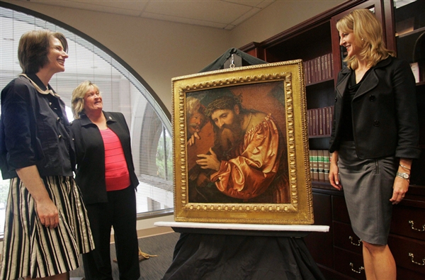
The work in question is a 1538 painting by Girolamo de Romani, also known as Romanino, depicting an image of Jesus Christ in an unusual copper-colored robe, carrying the cross on his right shoulder while being dragged by a soldier. It was held in private collections by European families until 1914, when Gentili purchased it. When the Nazis marched into France, many of Gentili’s heirs fled — but weren’t able to take the family patriarch’s art collection and many other valuables. Vichy French authorities auctioned off the property, including more than 70 pieces of art, and barred the family from returning to claim the art work in 1941. The Romanino painting was acquired by the Italian government-run museum Pinacoteca di…
Read More
On 18 Dec, 2011 With
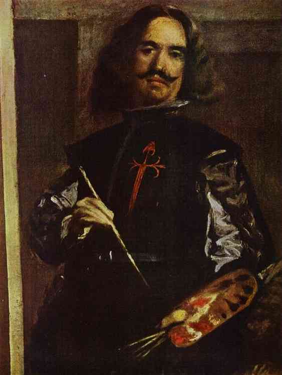
The Old Masters: Velázquez’s Palette Diego Rodríguez de Silva y Velázquez was a Spanish painter who was the leading artist in the court of King Philip IV. According to Carmen Garrido, Head of Technical Services at the Prado Museum in Madrid and author of Velázquez: Tecnica y Evolución, Velázquez’s palette consisted of the following colors: WHITE: composed of lead white and calcite YELLOW: yellow iron oxide, lead-tin yellow, and Naples yellow (the latter, sparingly) ORANGE: orange iron oxide and vermilion of mercury RED: red iron oxide, vermilion of mercury, and organic red lake BLUE: azurite, lapis lazuli, and smalt BROWN: brown iron oxide and manganese oxide BLACK: organic black of vegetal or animal origin GREEN: azurite, iron oxide, and lead-tin yellow PURPLE: organic red lake and…
Read More
On 11 Dec, 2011 With
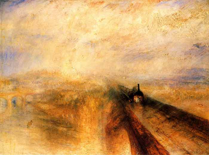
Turner’s Palette Joseph Mallord William Turner was an English Romantic landscape painter, watercolourist and printmaker. Cobalt blue Emerald green Viridian Orange vermilion Barium chromate (yellow) Chrome yellow Chrome orange Iodine scarlet Burnt umber Carbon black Turner’s yellow Many red lake colors White [titanium? flake?] This doesn’t feel like his complete palette. And his palette did change over time.
Read More


